Astrophotography in itself can be quite challenging, especially when you’re doing deep sky photography. Because of this we tend to focus on all the technical details and aspects of astrophotography; aligning your mount, balancing equipment, flexure, telescopes, guiding, camera’s, processing the image etc. For some people this is also what makes astrophotography fun, and they are less interested in the end result. For the majority however, the goal is to make an interesting and beautiful image and this seems to be quite easily achieved in the world of astrophotography because the subjects we photograph are very interesting and beautiful! As a result many astrophotographers end up just trying to capture the target object with as many details as possible, while battling elongated stars and of course the always occurring noise. But this leaves us in many cases with very dull and repetitive images, that are more a prove of achievement rather than a beautiful and interesting image.
As astrophotographers we should focus more on composition and framing in order to create truly interesting images. There is a lot we can learn from ‘normal’ daytime photography in terms of framing and composition. So let’s look at some tips to get you started!
As astrophotographers we should focus more on composition and framing in order to create truly interesting images
1. Stay away from the center
The #1 error made in astrophotography is not adjusting the framing of the photograph; many just slew to the object they want to photograph and start imaging when the object is in their field of view, or even adjusting the slew to put the object in the center. This is a mistake in many cases because you run the risk of leaving out other interesting objects that could have been in the same fov of your image.
An excellent example of this is the Orion nebula. The #1 object to photograph for many starting with astrophotography. In many cases centring on this nebula will cut off the running man nebula that’s in most cases in the same fov of many camera’s. Slightly adjusting the framing and you will have both nebula’s in your image, creating an image that perhaps is twice as interesting than just M42 on its own.
Another example is M106; put it in the middle and you will leave out the very interesting and beautiful coloured stars near another galaxy that make the fov really interesting. Instead you will end up with just a beautiful galaxy in the middle with a lot of empty space around it. Slightly adjusting the fov and the image becomes more interesting immediately:
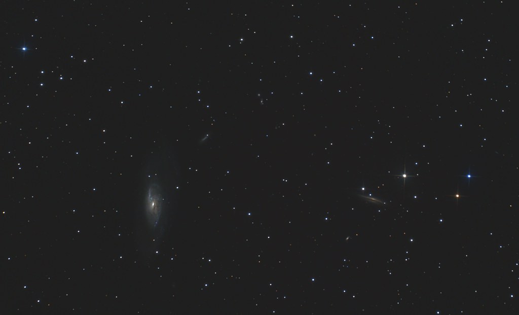
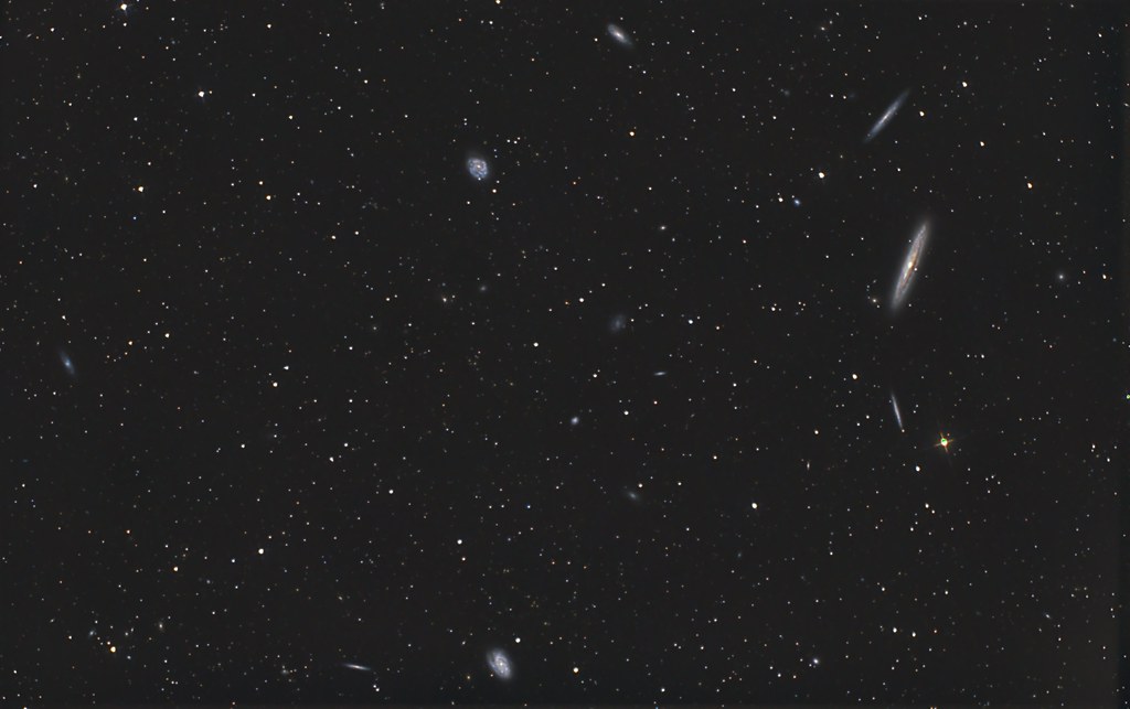
Both the M106 and M42 are examples where a slight adjustment of the fov is enough, sometimes it takes a bit more planning and trial and error to see what would make the most interesting fov. Take a look at the following example of NGC4216 and friends in the Virgo cluster;
I could have just centred on NGC4216 (the biggest galaxy on the left in the middle of the three) and would have ended up with a nice image of 3 big edge on galaxies and some others in the same fov. However, I would have left out many of the other interesting galaxies and a very static image. With this framing I captured as many of the bigger/interesting galaxies as possible, resulting in a more interesting image that feels like a lot is happening and you can keep looking at it and discovering more galaxies, showing the richness of this part of the Virgo cluster.
However, of course there are also objects that nicely fill most of the fov and you need to frame it in the center in order to capture the whole object. Of course you’ll want to center the object in these cases, like this picture of M33;
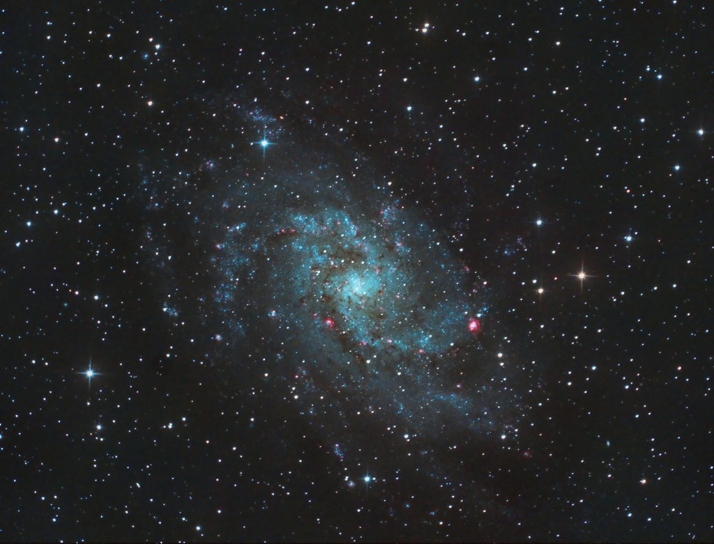
However, when the image does not fill most of the fov and even if there is nothing else in the fov, placing the object in an other place than the centre will make the image more interesting in most cases. I will come back to this later in the article when talking about the rule of thirds and use of viewing lines.
2. The rule of thirds
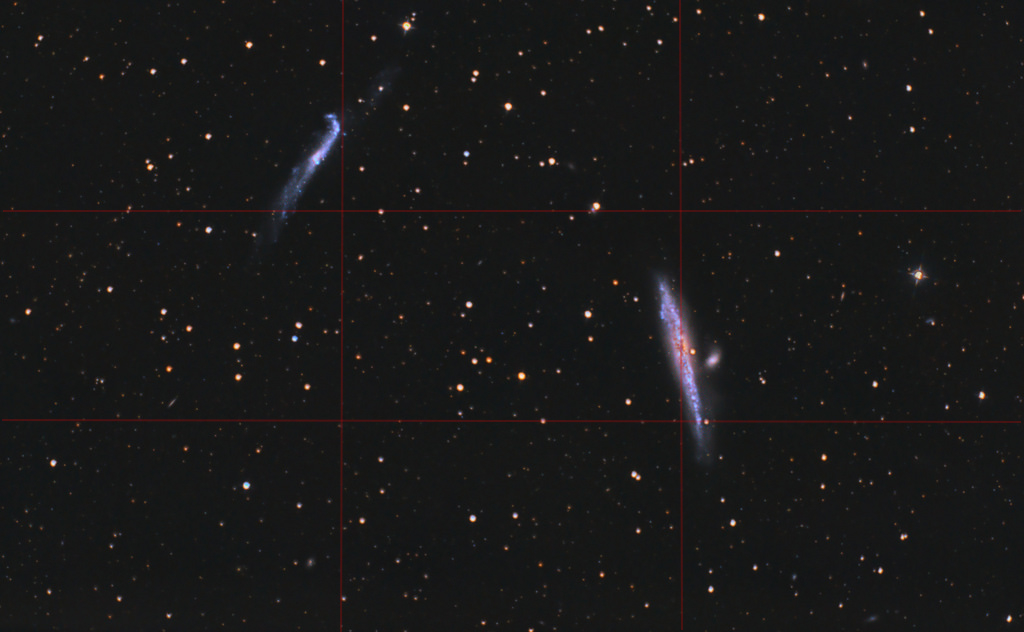
The rule of thirds is one of the most useful composition techniques and it is frequently the difference between your regular ‘holiday quick snaps’ and more interesting travel photography. This rule has so much impact that many cameras include a feature to actually divide your picture in thirds in your viewfinder and/or liveview. Basically it means that you divide your picture in 9 segments by drawing two lines horizontally and vertically. The cross sections of these lines are the locations in your frame where it is most interesting to place your object(s). It is more pleasing to the eye and more ‘natural’. We can of course apply this to astrophotography as well, like in the next example:
As you can see it’s not a 100% fit to the rule of thirds, but obviously this is no exact and strict rule but a guiding principle. This picture is actually a great example of how you need to combine the different composition principles and can’t just pick one; I wanted to include the fainter galaxies on the right bottom of the frame, so ended up positioning the main objects slightly higher above the cross sections of the lines.
Which cross section you choose to place your object(s) greatly depends on the other composition principles and the way people look at images like the fact that people (in western cultures) read and look rom left to right, the application of lines in the picture to guide the viewer to the object and the overall balance of the picture.
3. Guiding the viewer: leading lines
There are several ways you can guide the viewer towards your main subject of your image. When photographing people for instance, you need to pay attention to the direction the people are looking, since the viewer will follow that look to see where the people are looking at.
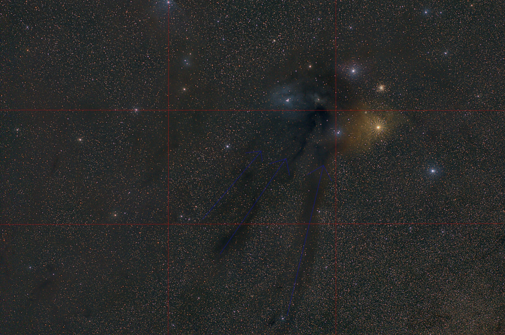
Similarly, and more applicable for astrophotography, you can make use of lines and structures in your photo to direct the viewer through the picture: the so called ‘leading lines’. People will automatically (and subsconsciously) follow those lines when viewing an image. Taking into account the fact that people view an image from left to right and you end up with leading lines that run from left to right to make a visual more easy and pleasant to the eyes. Like this example:
Clearly the region close to antares is the main subject of the photo and placing it to the left side of the photo and using the dark bands that run towards the milky way as leading lines I ended up with an image that is easy on the eye and pleasant to look at, while also showing the interesting dark clouds in this fov. If you place it on the right side you have a very ‘tight’ picture and a lot of ’empty space’ where you don’t look at. So the overal balance and feel of the picture benefits greatly of picking the upper right cross section of the ‘rule-of-thirds-lines’ and using the bands of dark dust to guide the viewer to this point in the frame.
4. Overall balance: pay attention to the empty space
The overall balance of the image is important, as it is easy and pleasant on the eyes to look at a nicely balanced image. In most cases this means carefully picking the cross sections of the rule-of-thirds and not placing two objects on the same side of the image, resulting in that side of the image to feel ‘heavy’ and therefor unbalanced. When paying attention to the balance of the picture you also force yourself to think about all the ’empty space’ in your image and not just on the subjects.
5. Movement and speed
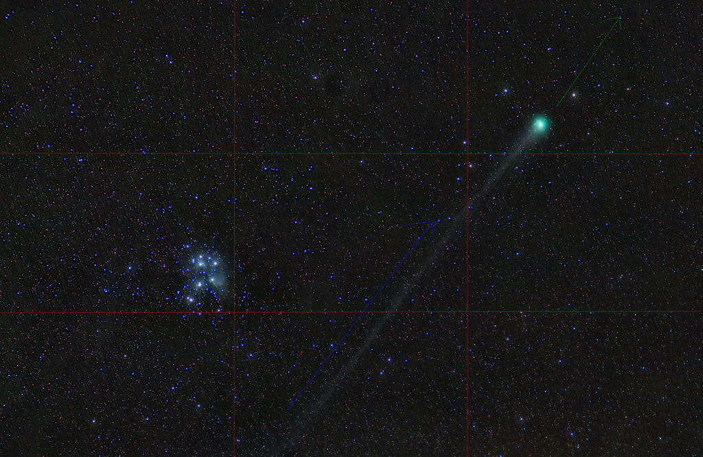
Another principle from daylight photography; the viewer will follow the direction of a moving object, and look beyond that object. This is another way of guiding the way someone views a picture and it also means you need some room in the photo beyond the object in the moving direction. In astrophotography we don’t encounter much movement in most objects, at least not movement that is apparent in the picture, but we do see this very strongly when photographing comets. Especially if there is a good long tail there will be a very strong guiding line for the viewer as well as perceived motion. Please note that the viewer will subconsciously assume the direction of the comet is in the continuation of the direction of the tail, which obviously in reality is not the case!
In the next example you can see that the photo already starts to feel ‘tightly framed’ because there is not so much space in the direction of the tail, beyond the comet. However, I needed to also take the length of the tail into account and wanted to show as much of it as possible. So combining all the composition rules resulted in this picture of comet LoveJoy:
Combining all 5 composition guidelines
It is most important you don’t just pay attention or pick one of the mentioned rules or principles, but you take them all into account. Let’s look at the above picture of LoveJoy to see how this works;
1. Stay away from the center
I wanted to show the comet in it’s wider context, so I had to choose the framing in such a way that I could include the Pleiades as well as showing as much of the tail as possible.
(Seriously, please STOP putting the comet’s head in the middle and cutting of it’s beautiful tail!)
2. The rule of thirds
I put both subjects of this picture carefully in the cross sections of the ‘rule-of-thirds-lines’. I chose these particular cross section because of the overall guidance of the viewer:
3. Guiding the viewer
When looking at this photo the viewer will ‘enter the image’ from the left, noticing the pleiades probably first. The tail nicely starts next to the pleiades, leading the viewer all the way up to the comet’s head, and thus nicely guiding the viewer through the whole image.
4. Balance
By placing the Pleiades and the comet’s head slightly above the cross sections of the ‘rule-of-thirds-lines’ we make the image more balanced by creating less empty space above the Pleiades and slightly more below the comet so the empty spaces are more equally balanced.
5. Movement and speed
The comet is actually moving almost perpendicular to it’s tail, from right to left. However, the viewer will see it differently as it looks like the comet is speeding in the direction of the tail, literally leaving the tail behind. So the room on the upper right side of the comet’s head is important and cannot be cropped to tight. As I said before, ideally there would have been more space for the comet to ‘move into’ so it feels less tight, but that was not possible when taking all the composition rules into account.
Experiment
Probably the most important advice in terms of creating more interesting astrophoto’s; experiment with the composition. The above rules and guidelines will help you, but should never be applied strictly as I hopefully have showed to you. The most important thing of it all is to actually THINK about your composition and not just start imaging once you have your subject in your fov.
This means a certain knowledge about the area of the fov, and certainly makes it important that you plan your photography sessions ahead. Next time we will look at some tips on how to plan your composition and photography session.

[…] Composing Astrophotographs […]
[…] User Testimonial 2: Rachel, an artist and photographer, appreciated the lens’s image quality and minimal distortion. She found it perfect for creating wide-angle astrophotography compositions. […]